

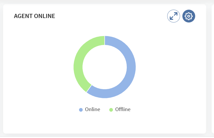
I get really annoyed when I look at the donut charts (stacked or normal or 3D) in the SOTI MobiControl interface as they look promising but when you look at the data they are misleading.
The most basic example is this donut chart that shows the online/offline devices:
You can see at a glance that ca. 60% of the devices are Online and 40% are Offline, but in reality that is not the case.
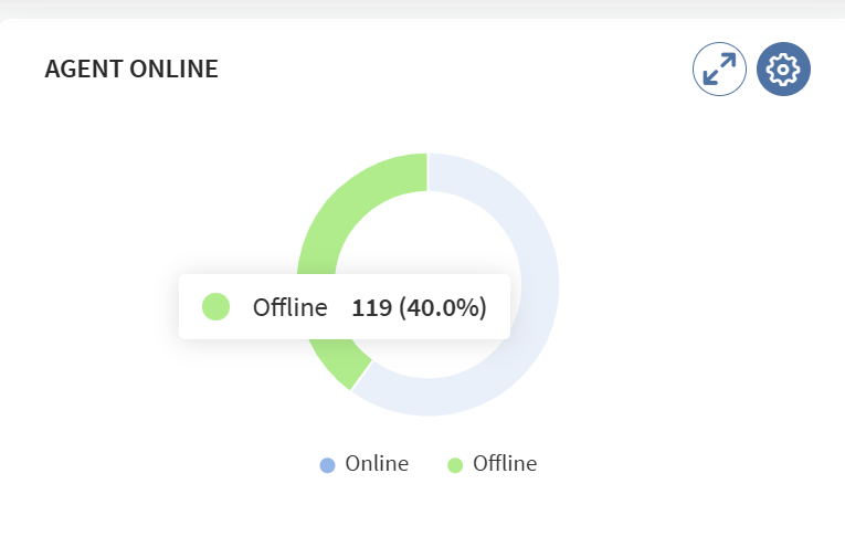
In this example, out of 1975 devices, only 119 are offline which is ca. 6% and not 40%
When you hover over the offline portion, the data is clearly there:
It think that it is really a shame that such a cool diagram gets fed with false information for some reason.
Does anybody know if it will be fixed in the near future?


